
SRAM
Overhaul of a bike management app that lets the users tune their controls and bike performance.
What is SRAM?
SRAM is an innovative bicycle parts manufacturing company, leading the space with wireless bike components.
What is my role at SRAM?
Product Designer, AXS App
I was a part of the expansion on the Digital product group extending the rider experience with the AXS mobile app.
Bike Garage Redesign
What is it?
Core part of the AXS app that lets the rider configure components on their bicycle
Feature overview
Add, manage and remove bikes
Add or remove and monitor components
Configure bike controls
Performance tuning for bike parts
Project Aim
Present bike readiness in a scannable format
Organize bikes and components in an intuitive hierarchy to configure and access component information
Simplify process of adding components on bikes
Target audience
SRAM targets the upper echelon of cyclists. These are people who:
Experienced cyclists spending 15-40 hours on bikes on average
30 - 55 year old (majority being 40+ males)
Know what they want and expect the bike to perform as well it possibly can

Current Design Analysis
A heuristic analysis was performed, and then usability testing was done to confirm pain points of the current design. These were the main pain points:
Excessive Scrolling
Disparity between function and status of components
Outdated visual design
Lack of value propositions to return to app
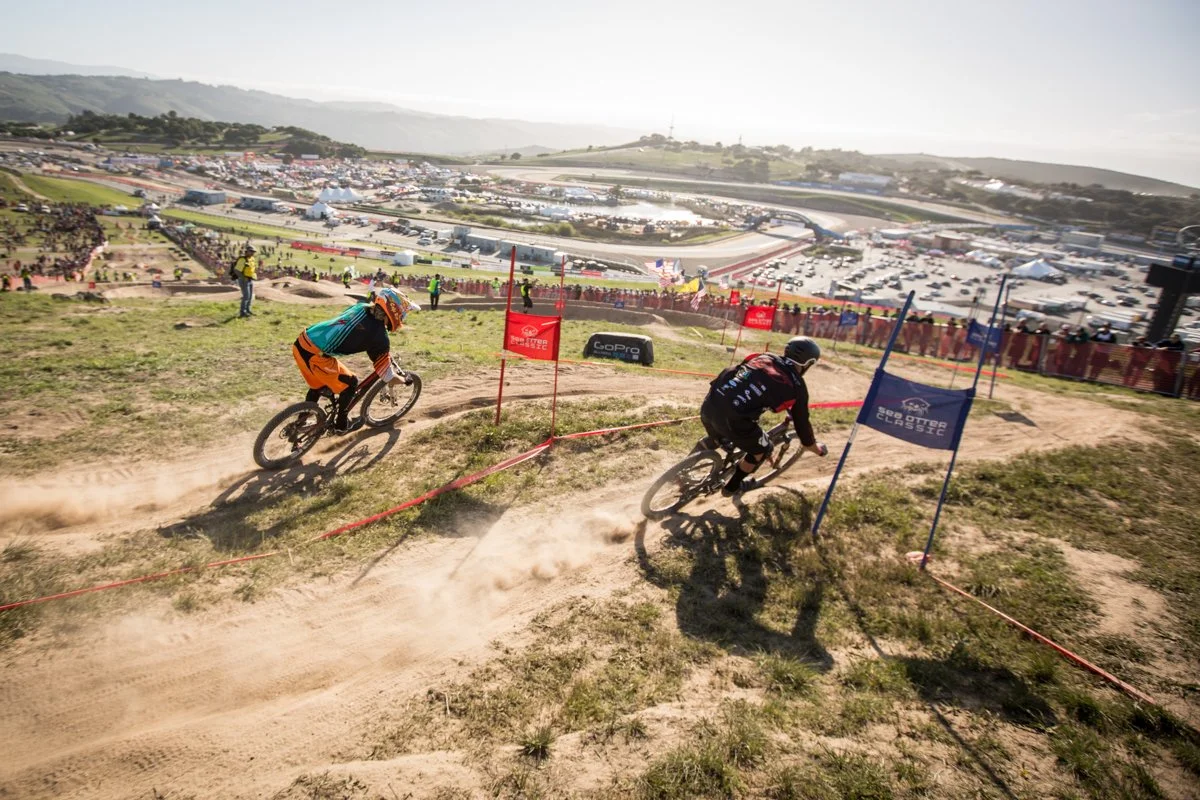
Sea Otter Classic Research
Sea Otter classic is a yearly bike festival in Monterey, California. It attracts everyone from bike enthusiasts and racers to people from different parts of the bike industry in power-packed weekend. This was a great opportunity to perform ethnographic research with riders that fit the SRAM user persona. 8 interviews were conducted with focus on their expectations from the app, current rider journey and adding value propositions.
Average bikes/person: 2
While the number of bikes depends on many factors (location, terrain, financial buy-in, etc) the average number of bikes per person was 2: A road bike to train and a mountain bike to hit the trails on the weekend.
Ride Rituals: Battery and Weather
The ride rituals depended on “rider level“; going from a visual inspection for beginners to a bigger checklist for more advanced riders. Battery and weather check were the common denominators for all riders.
Appetite for SRAM content
When in trouble, users often use google and youtube as resources, but there is an appetite for SRAM content that is more accessible and trusted by the users to be placed in the app. Content like tutorials, maintenance tips, troubleshooting will add value to our riders.
Maintenance and troubleshooting
Riders want to be proactive about maintaining their bikes. Giving them service intervals and providing information about their components will help riders elongate component lives and increase trust in SRAM. Troubleshooting wizards can also be added to minimize the cost of repair and replacement for SRAM.
Ride activity in app
Ride activity, while being the most sought after feature, sees less engagement due to it’s presence on the website. Integrating it in the app will help increase Daily Active Users (DAU).
UX Pain points
Business implications
Outdated and inconsistent design
Confusing architecture and functionality
Lack of value propositions
Low App Store Ratings (2.3 stars)
Declining Daily Active Users
Low adoption rate from new users
How Might We simplify and redesign the experience to
increase rider engagement?
Guiding design principles
Intuitive
We create easy-to-use products that are supported and enhanced by the AXS experience.
Innovative
We create products and experiences that are new, exciting, and push the industry forward.
Performance-oriented
We create high-quality products that are fast, efficient, and fun to use.
SRAM did not have design principles for digital products at the time. Following this discovery, I had several chats with the founder of the company on the intended perception of the products and our brainstorming sessions led us to the key guiding principles for digital product design.
Early design iterations

Design Refinement
Modern Visual Design
The visual design was overhauled to match modern styles, as well as the platform expectations. A 80/20 rule was applied to leverage native components as much as possible.
Scalable Information Architecture
The architecture is divided into levels (Garage, Bike, Subsystem), letting us expand the capabilities easily without reworking architecture in the future. Additionally, the use of subsystems ensures efficient use of screen space, and function localization.
Ready to Ride Dashboard
A clean dashboard shows more components to check ride readiness. Additionally, a custom component helps make the design future proof. This design also celebrates components by using modern iconography.
Intuitive context-based design
The design is highly contextual making it intuitive. The firmware update shows up only when required. Using subsystem lets us customize the help and support information with next generation tech manuals.
Help videos and documents
Riders’ appetite for content is satisfied by showing all the content SRAM has around the components owned by the rider. It is more accessible and makes it easier to find and consume the information.
Less scrolling
Every screen has been designed to use the screen space as efficiently as possible. First screen can fit 2.5 bikes, which should work for most riders without scrolling. Bike detail screen uses subsystem to show components efficiently.
Design system snippets


Prototype
Click on the prototype to visit and click through the prototype
Change in direction
The team decided to change directions at this point. The new alignment was to explore the card based UI and see if it better fits the expectations of the team and the users. Here are some reasons which caused this change in direction:
Concerns around execution
With the current execution quality, the team wanted to go with a simpler UI that will be less complicated to implement.
Big change for existing users
The team had some concerns around the existing users perceiving the change as too radical.
Low confidence in subsystems
The team had some hesitancy in combining components together in subsystems and it’s execution.
Card based UI
Card based bike list
The bikes are now in a carousal with the most important information up front, giving the way to personalization in the future.
Simplified battery and pressure readout
The simplified component list emphasizes more on the battery list, calling out instructions when the component is disconnected or critical.
Personalization: Bike widgets
As we found in initial research, people expect different things, the card allows users to prioritize things by placing them on the card.
Before and After
Previously the user had to scroll past all the components on each bike to get to the intended bike, and scroll further to see the component status.
The new design lets the user swipe to switch bikes and view component status in a focused view
User Task: Go to the third bike and check ride-readiness (checking pressure and battery levels)
Stay tuned to see more updates on this project
That’s all the updates for now. This project will soon move into active development and updates will be shared here. In the mean time check my other projects or feel free to contact me to know more.